DESIGN SYSTEM
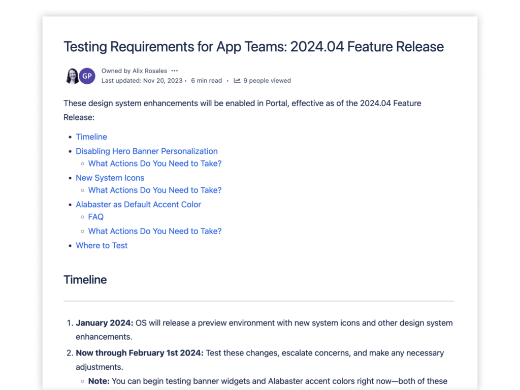
Testing Requirements for App Teams
These design system enhancements will be enabled, effective as of the 2024.04 Feature Release:
- Disabling hero banner personalization
- New system icons
- Alabaster as default accent color
Starting now through February 1, 2024, app teams should start testing these changes, escalate concerns, and make necessary adjustments. Add /?ospClientPreview=true to your URL to test these changes in your CI/T20 environments; it will be available in CQA when it’s upgraded to the 2024.01 release in December 2023. Contact us with any questions.
WEB COMPONENTS
SoHo Deprecation Migration Guide
Our older jQuery-based components are being replaced with new Web Components. The jQuery libraries will move into maintenance mode as we focus on the Web Components libraries. To better accommodate the challenges of adoption, we’re extending the SoHo deprecation timeline. Look for the updated deadlines in early 2024.
In the meantime, we’ve published a migration guide. You can learn more about the Web Components technology and review a library of sample projects with guidance and integration examples. This is a living document, so check back for updates. Need help? Contact us.

CHANGELOG
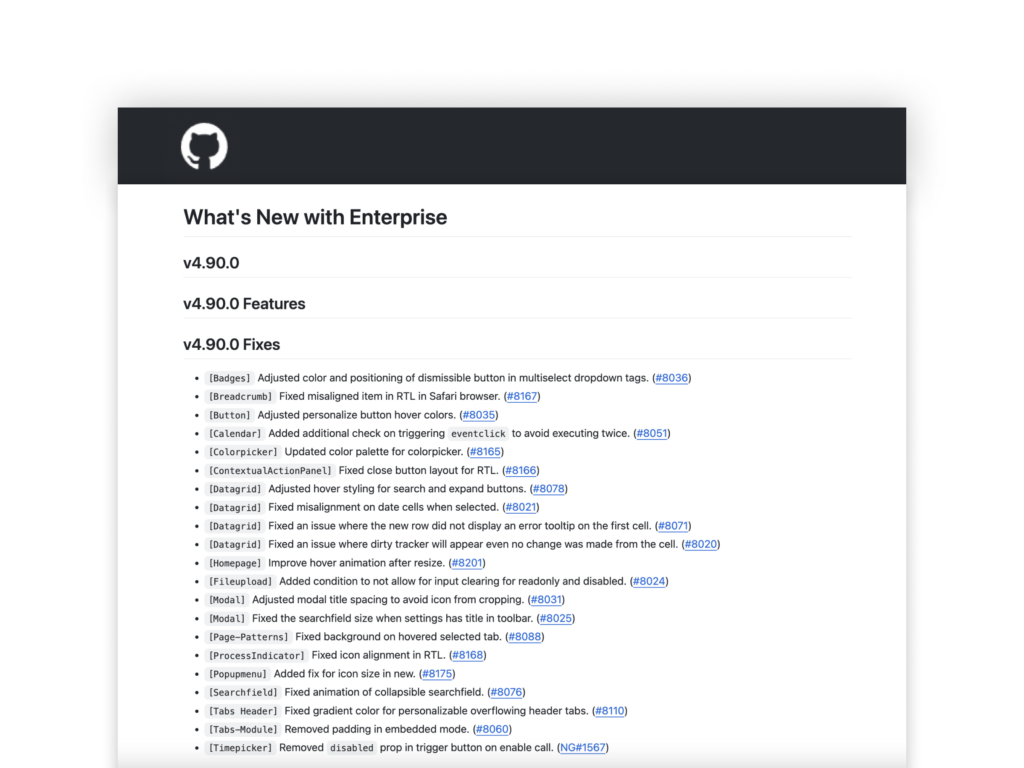
The Latest from Development
The v4.90.0 release includes 20+ dev fixes for badges, colorpicker, datagrid, modal, and searchfield.
ROLE-BASED CONTENT
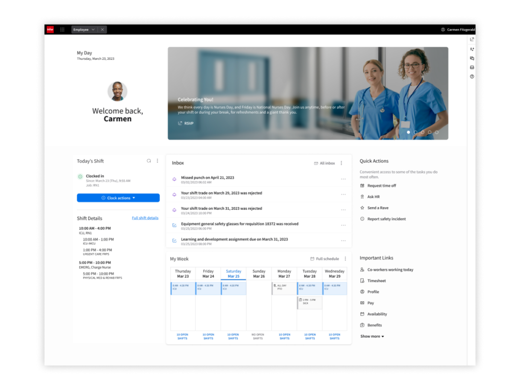
Workspaces
The 2024.04 Feature Release is expected to include 13 new role-based Workspaces for Infor Industry CloudSuites: three for HRT, four for FSM/SCM, three for LN, and three for M3.
Want to learn more about Workspaces?Check out these demos for Workspaces from the 2023.10 Feature Release. Find more demos on Infor U—just filter the course catalog by “Workspace.”
COMPONENTS
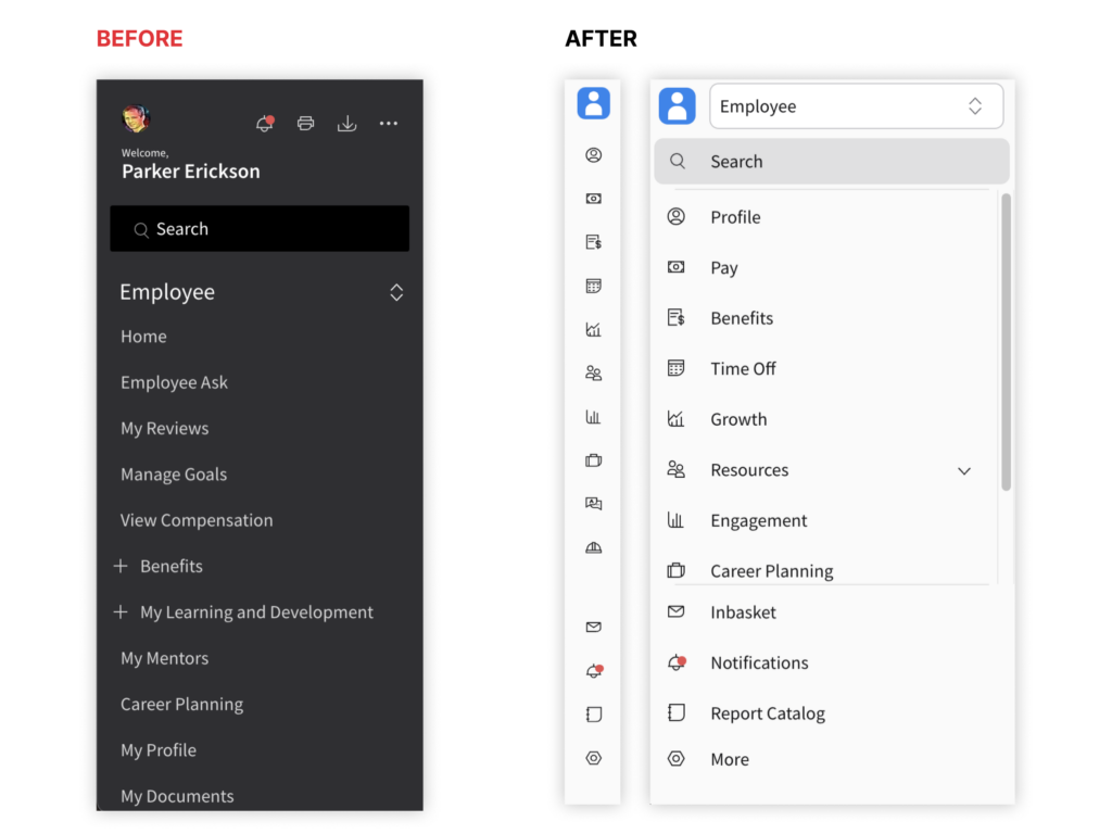
Module Nav
The new collapsible side navigation menu replaces the existing static navigation. It’s designed to make our applications more user-friendly, intuitive, and efficient.
- Collapsible menu: Users can expand or collapse it as needed
- Modules: Menu items have been replaced with modules that represent capabilities within the application
- Icon for each module: Icons make it easier for users to recognize and understand the capabilities that each module provides
The module nav provides a clean user interface that optimizes the use of available screen space, reduces cognitive load, and addresses issues and concerns raised via user feedback.