Custom Icons
Overview
The design system provides several core system icons. Before creating a new icon, consider whether
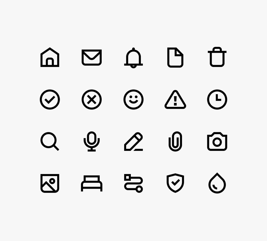
System icons use clear metaphors and are drawn in a minimalistic style using simple geometric shapes for optimal legibility at a small size.
Icon size
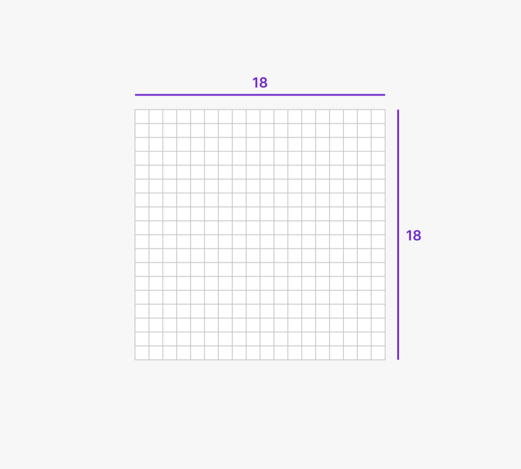
System icons are created and displayed at 18×18 points (pt) with pixel-accuracy in mind.
Always display them at 100% size in the user interface.
Keylines
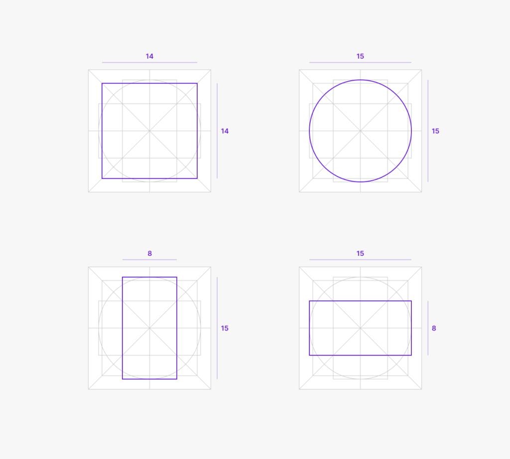
Keylines help maintain consistency in weight, optical size, and placement inside the bounds for all icons across the set.
Use them as a guide for placing circles, squares, and rectangles that make up the primary shape of your icon.
Design details
System icons have a friendly yet professional personality. While most edges and corners are sharp, some corners are rounded for a softer look.
These rounded corners are generally applied to the bottom edges of the icons. However, reference real-world objects when deciding which corners to round off in order to keep them familiar and maximize recognizability.
Technical details
Line weight
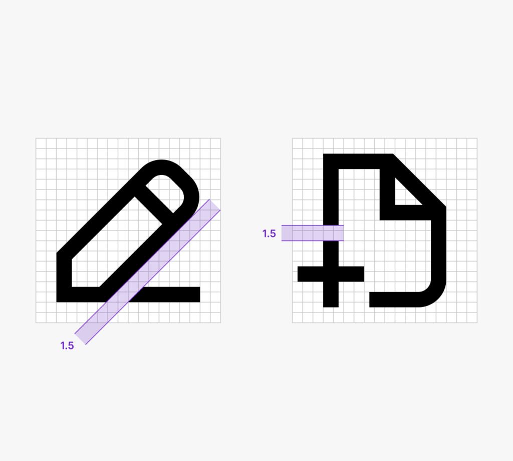
Always use a 1.5 pt stroke, centered on the path.
Never modify the line weight for the purpose of allowing more detail in an icon.
The only exception to this rule are icons that demand a different line weight to communicate their intention, such as icons for bold or extra light text formatting options.
Color
Always use #000000 at 100% opacity.
Draw and store the icons in full black and adjust their fill on the components in use in Figma, and in use in code.
Pixel Perfection
Modifiers
Modifiers are secondary objects in an icon.
While they can be placed anywhere within the bounds, complete icons are optically aligned using their primary object if possible, ignoring the modifier.
When modifiers overlap the primary object of an icon, use a cutout of at least 1.5 pt.
