Profile Information
The profile information page layout is designed to present the user with details about any type of entity—such as items, products, customers, employees, suppliers, or vendors—making it adaptable across various industries.
While the specific fields within each section may vary depending on the entity and industry, the overall structure is widely applicable and supports a consistent user experience in diverse contexts.
When to Use
Follow the profile information page layout when:
- You need to present comprehensive information about a single entity—a person, item, company, etc.—in a clear and organized way.
- The user must quickly identify, review, and act on key details about the entity as part of their workflow.
- Contextual actions (like editing, contacting, or initiating processes) are required directly from the profile page.
Key Sections
A typical profile has 3 sections of content:
- Header area
- Primary information
- Secondary information
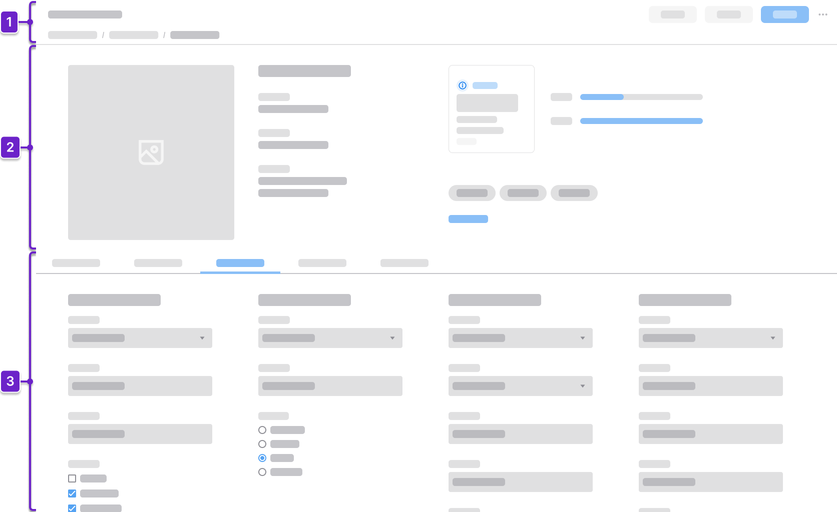
1. Header Area
Tells the user where they are within the application and provides context about what’s on the page. This generally includes the page title and actions. It could also include a breadcrumb.
2. Primary Information
Highlights key identifying details that provide a quick overview of the profile. This helps the user instantly recognize and understand the essential identity of the person, customer, vendor, or product.
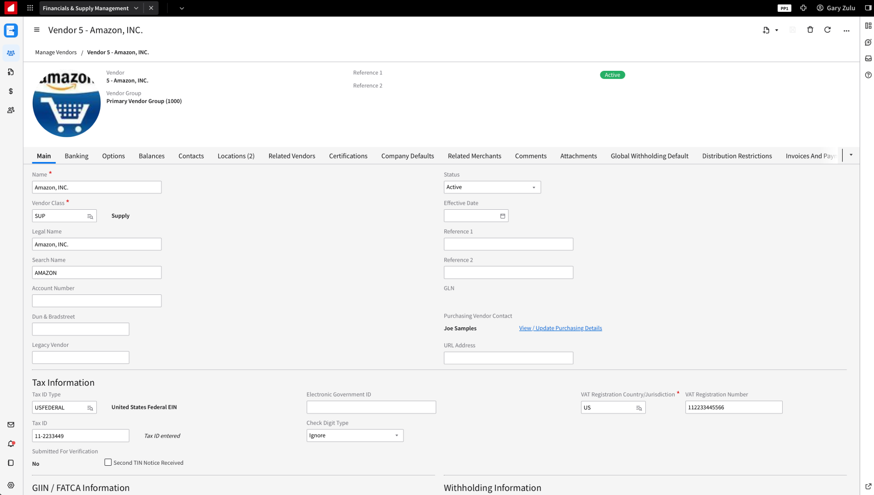
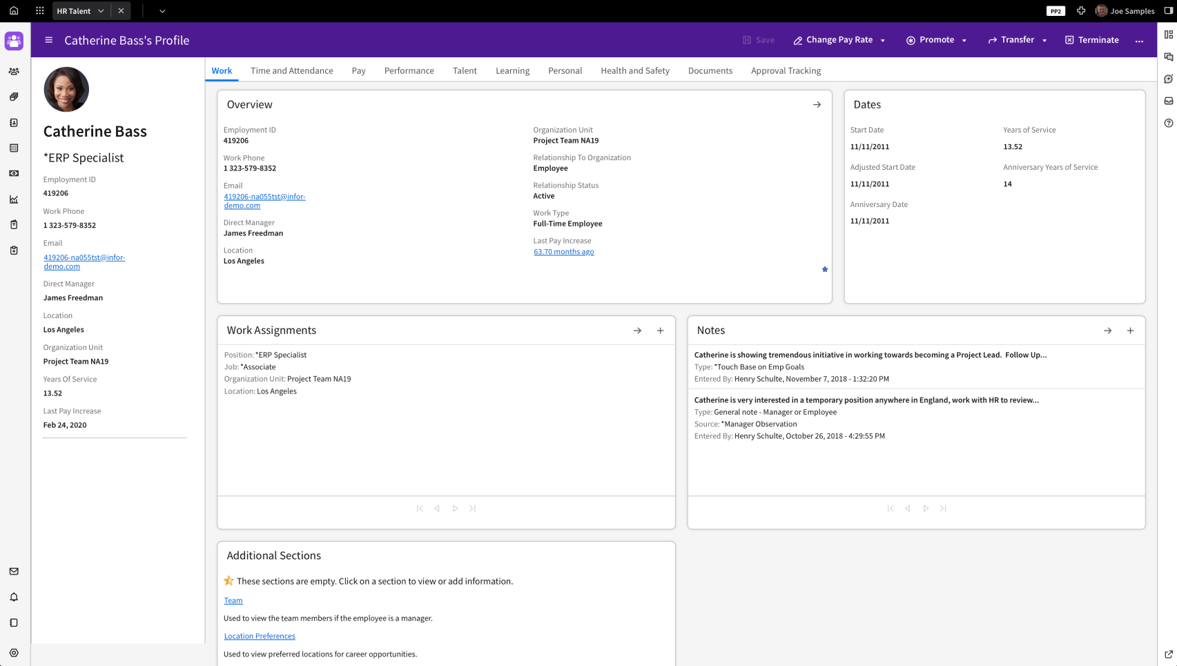
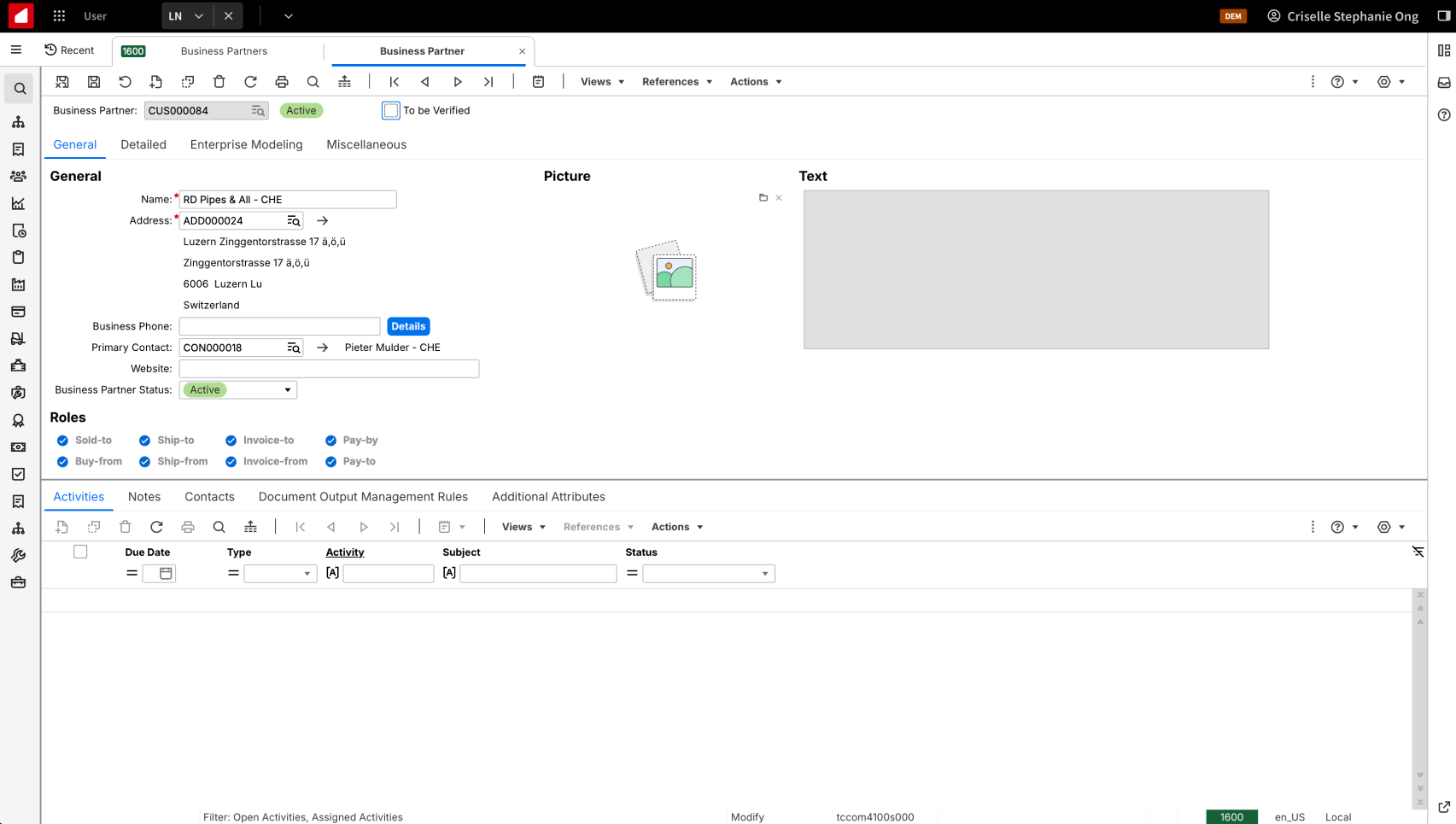
For people or company profiles, primary information may include:
- Image or avatar
- Full name or company name
- Job title or role
- Employee or contact ID
- Contact information
- Status
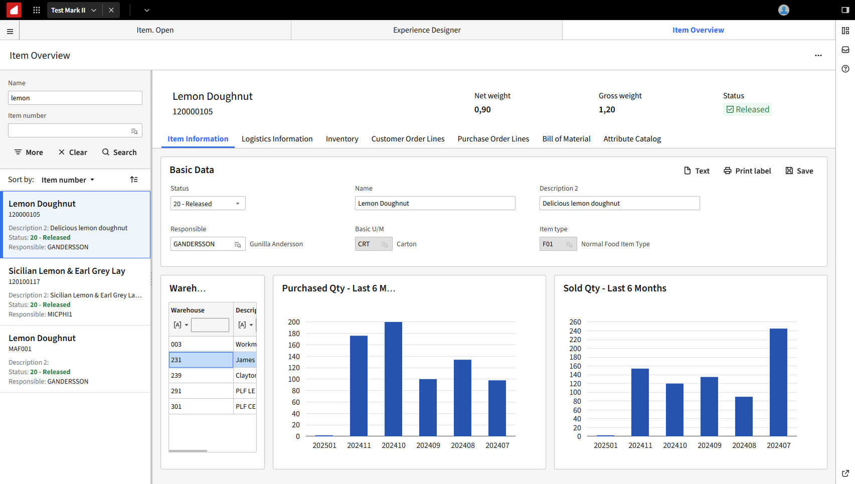
For product or item profiles, primary information may include:
- Product image or thumbnail
- Product or item name or title
- SKU or item ID
- Description
- Status (active, draft, or discontinued)
- Brand or manufacturer
3. Secondary Information
Offers additional context to help the user make decisions and take action in their workflow. When there’s a large amount of information, additional navigation can be used to group this content.
The primary information remains fixed above the secondary information. For example, the secondary information on a product or item profile page may include:
- Production line
- Plant or warehouse location
- Inventory levels
- Alternate suppliers
Components
IDS components can help you build your profile page. The structure of the page will depend on how much more information the user needs to see. Here are some components to consider.
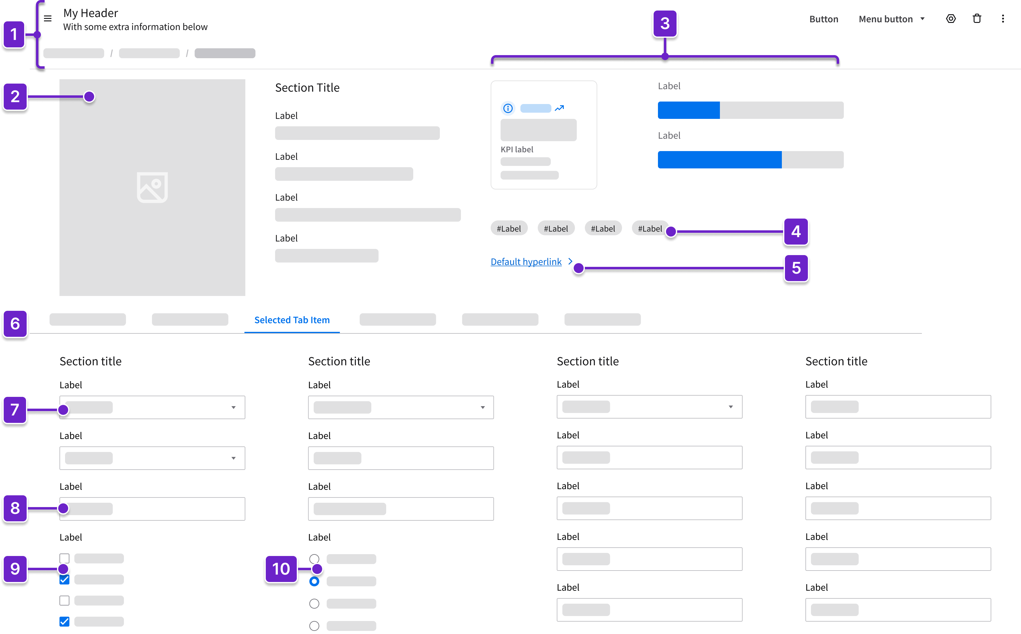
- Header
- Can include breadcrumbs and a toolbar with action buttons that are specific to the page.
- Image
- For user profile and company pages, this is generally a thumbnail image of a company logo or photo.
- For a product page, this could be a larger product image or a circle pager (also referred to as a carousel).
- Data visualizations (KPIs, counts, or charts)
- Displays key metrics at a glance.
- Action button
- Triggers an action, providing a clear call to action that enhances task completion.
- Tag
- Communicates status or categorization.
- Hyperlink
- Guides the user to the next step in their workflow or to a related action.
- Tabs
- Organize and display content in separate, easily navigable sections within the page.
- Clearly label each tab to ensure that the user has context as they navigate.
- Fieldset (editable or read only)
- Groups related form fields.
- Checkbox
- Allows the user to select 1 or more options, actions, or settings.
- Example: Preferred supplier
- Allows the user to select 1 or more options, actions, or settings.
- Radio
- Allows the user to select a single option from a set.
- Example: Active or inactive
- Allows the user to select a single option from a set.
- Dropdown
- Provides a compact way for the user to select from a defined list of choices.
- Example: Status or category
- Provides a compact way for the user to select from a defined list of choices.
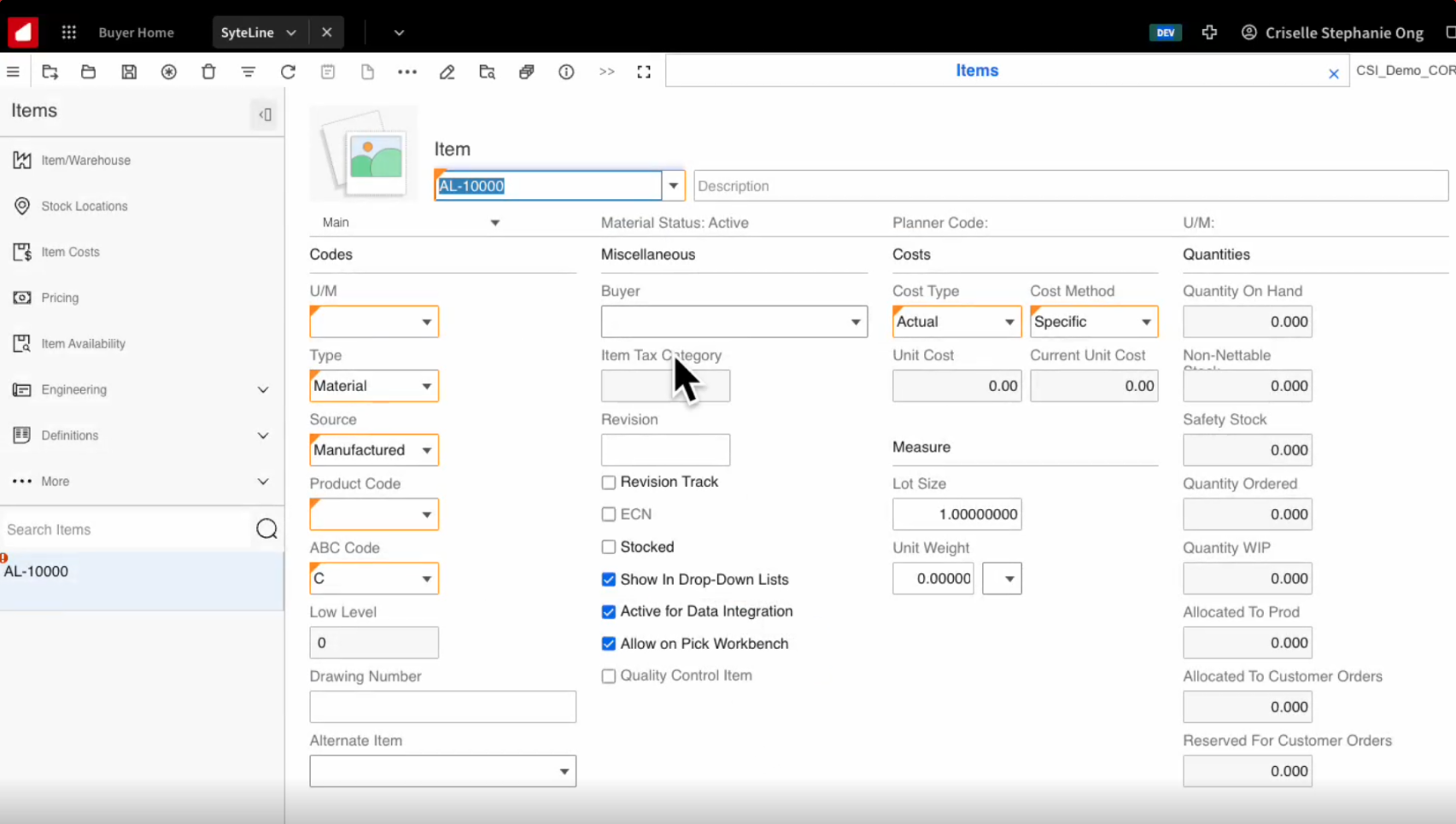
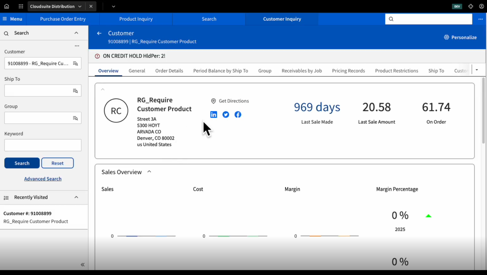
CloudSuite Examples
Here are some examples of what’s used in the CloudSuites today. Use them for reference only, as they may not reflect the profile information page layout pattern exactly as defined above. (Updated June 2025.)