Icon
An icon is a visual symbol that represents a common object, action, or concept—designed for consistency, quick recognition, and easy interaction.
When to Use
- Use icons:
- To help the user navigate a page. Icons can help users locate specific sections of a page, such as home, settings, or profile.
- To indicate status and urgency, such as an alert, error, or help.
- When space is constrained.
When to Use Something Else
- When the user’s action requires a clear explanation, consider a button. It can help avoid visual clutter caused by using excessive icons.
- Example: Use a button that says “Submit order” rather than relying solely on an icon of a checkmark.
Usability Guidance
- Use universally recognizable icons that are intuitive and meaningful, reflecting real-world representations.
- Maintain consistency by using the same icon for the same action or meaning throughout your application, ensuring that there is a uniform style for adjacent icons.
- When an icon’s meaning might be unclear, pair it with a descriptive text label to provide additional context.
- Select icons that accurately represent the specific context and message. Avoid generic or misleading imagery that could confuse users.
- Example: Don’t use a calendar icon for a financial report.
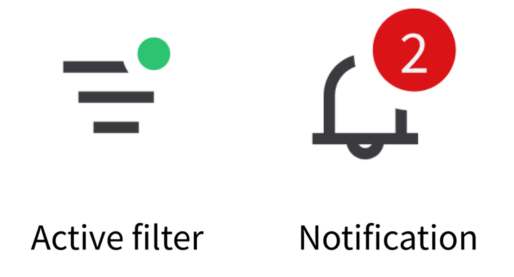
- An icon can also feature an indicator badge, such as a floating dot, which helps the user identify their active status. This functionality is frequently utilized for filters or notifications, delivering clear visual feedback.
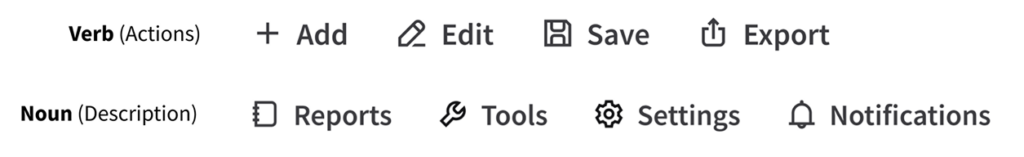
UX Writing
- Use sentence case when pairing a text label with an icon: Only capitalize the first word and any proper nouns.
- Clearly communicate the icon’s function with a label. Use concise, action-oriented text.
- Use verbs for actions.
- Examples: “Add”, “Edit”, “Save”, “Export”
- Use nouns for objects or features.
- Examples: “Reports”, “Tools”, “Settings”, “Notifications”
- Use verbs for actions.
Accessibility
- Avoid using color as the only way to convey meaning to the user. Try to include shapes or labels as well.
- Provide tooltips or labels for people who use screen readers.
Keyboard Interactions
Tabadvances to the next adjacent icon.Enteractivates an icon.
Related Pages
System Icons
System icons represent controls or specific actions. They’re drawn in a minimalistic style, using simple geometric shapes for optimal legibility at a small size. They can be found in toolbars, navigational menus, data grids, and hyperlinks.
Below are best practices for how to incorporate system icons in order to improve the user’s navigation experience.
Sizing, Padding, and Alignment
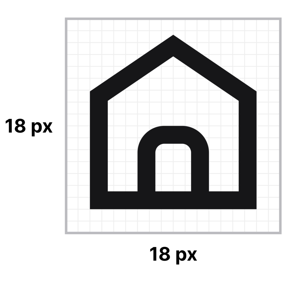
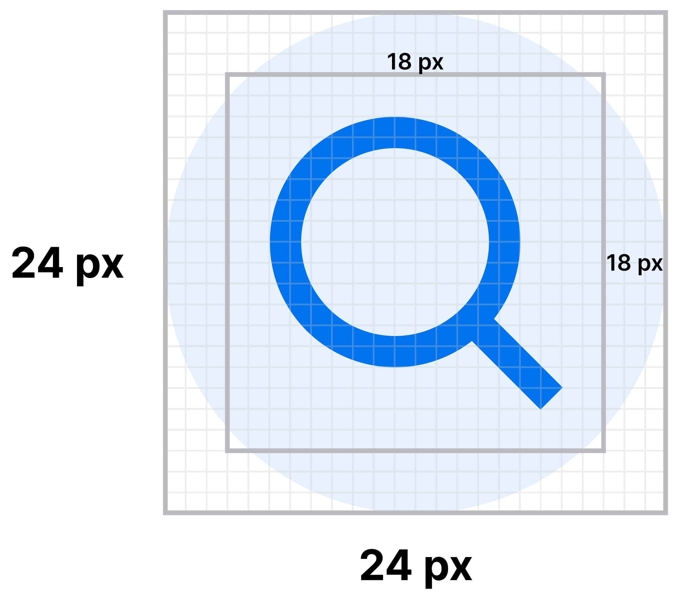
System icons are 18×18 pixels (px).
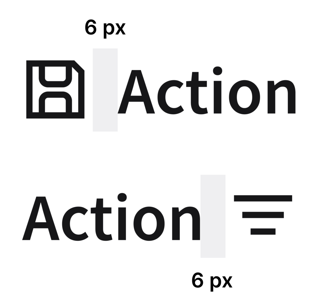
When pairing a system icon with a text label, align the system icon as follows:
- When the system icon precedes the label, the system icon is left aligned.
- When the system icon follows the label, the system icon is right aligned.
- In both scenarios, include 6 px of additional padding.
Do
Don’t
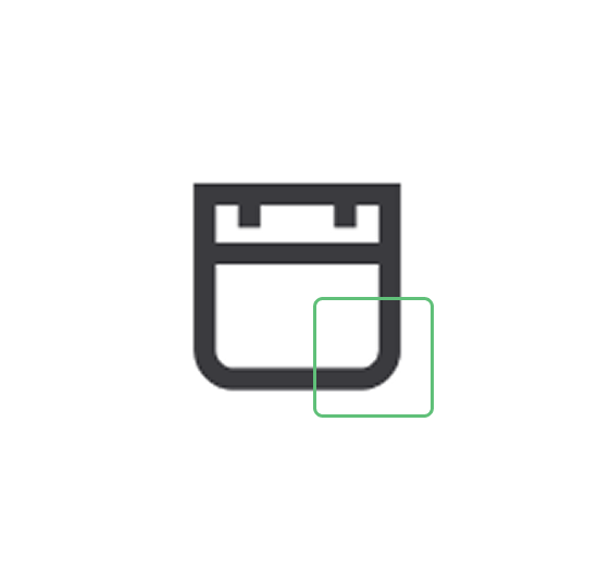
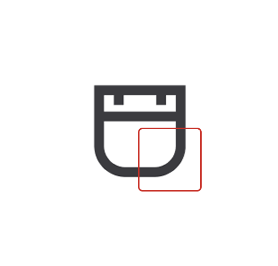
Do: Use the system icons correctly, in their intended sizes, as shown in this widget.
Don’t: Scale up the system icons. This example shows an empty state, which has its own separate library of icons.
When using a system icon in a container—such as in a button—the system icon is centered.
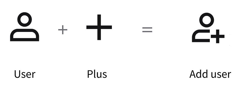
Modifiers
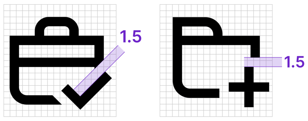
You can combine a primary system icon with a secondary system icon—called a modifier—in order to create a composite of system icons that conveys a more specific meaning to the user. The modifier is smaller than the primary system icon and is typically positioned in a corner or as an overlay. It serves to refine or narrow the primary action.
For example, combine a primary “User” icon with a secondary “Plus” icon to indicate “Add user”. Use modifiers only when they’re easily understood by the user and essential to the user’s workflow. They must be legible, visually balanced, and consistent with consistent with the following placement instructions. Use only one modifier at a time.
Place the modifier in the bottom-right corner of the primary system icon. If this placement obstructs a key visual detail of the primary system icon, move the modifier to the bottom-left corner instead.
If both the bottom-right corner placement and the bottom-left corner placement interfere with the clarity of the primary system icon, it’s ok to then consider the top-right corner or top-left corner.
Do

Don’t
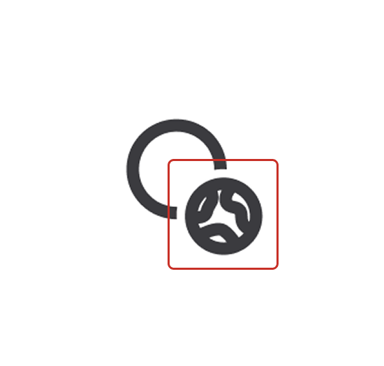
The modifier is repositioned to avoid covering the handle of the magnifying glass. Always adjust the modifier placement if it obscures the primary icon’s meaning.
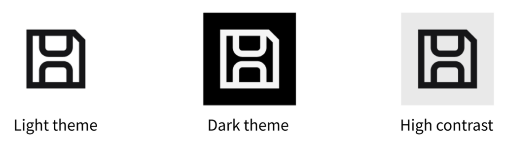
Color
The default color of all system icons is “color/foreground/default/default” for light mode (#161618), dark mode (#F5F5F5), and high contrast mode (#161618).
For colorized versions of system icons, see decorative icons.
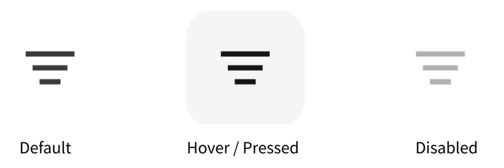
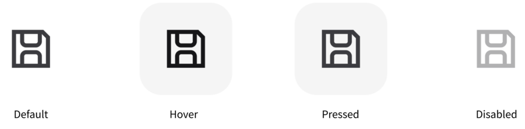
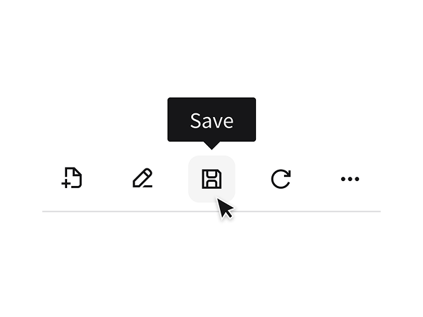
Active States
When system icons are used as action triggers, they must convey affordance and indicate their active or inactive states. It’s also important to provide clear feedback in order to meet accessibility standards.
Do
Don’t
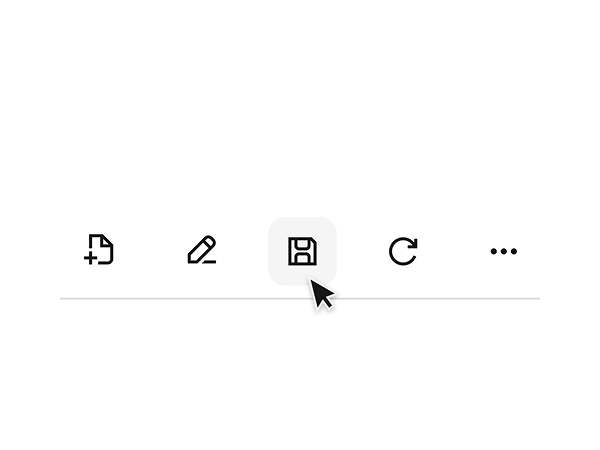
When an actionable icon doesn’t have a label, provide a tooltip to clarify its purpose. Without it, users may struggle to understand the icon’s function.
Toggle
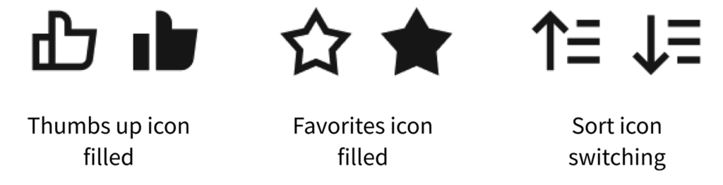
System icons can be used to represent a state. These states are typically binary: On/off; active/inactive; ascending/descending. When clicked, the user will toggle between different conditions. Their function is both practical and communicative—they initiate an action while simultaneously conveying the current state.
In many cases, the default icon is the “off” state and is outlined. The “on” state is the filled version of the icon.
For the “sort” icon, the default is ascending (the arrow is pointing up).
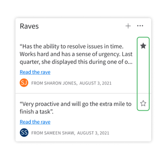
Some toggleable system icons—like the “thumbs up” icon and the “favorites” icon—are appropriate only within the context of the specific content that they affect. Their purpose is to express approval or to save something, without altering the overall layout or data set.
Other toggleable icons—like the “sort” icon—can be grouped with toolbar action controls. They will affect the presentation of all data or items across the interface, such as changing the order between ascending and descending.
Do
Don’t
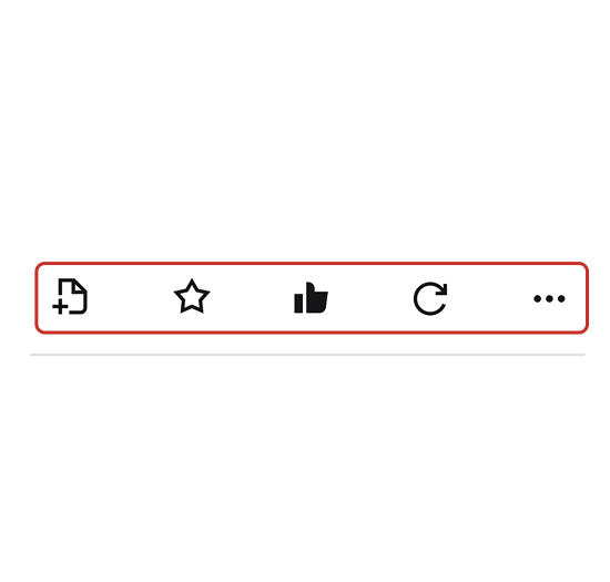
Do: The “favorites” icon is used correctly in context—as a toggle to like a rave—which provides the user with immediate feedback. Don’t: The “favorites” icon is used incorrectly in a toolbar, which doesn’t provide the user with feedback.
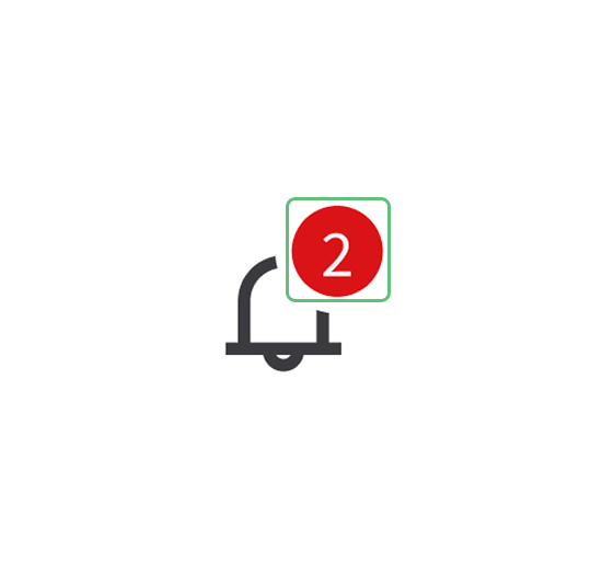
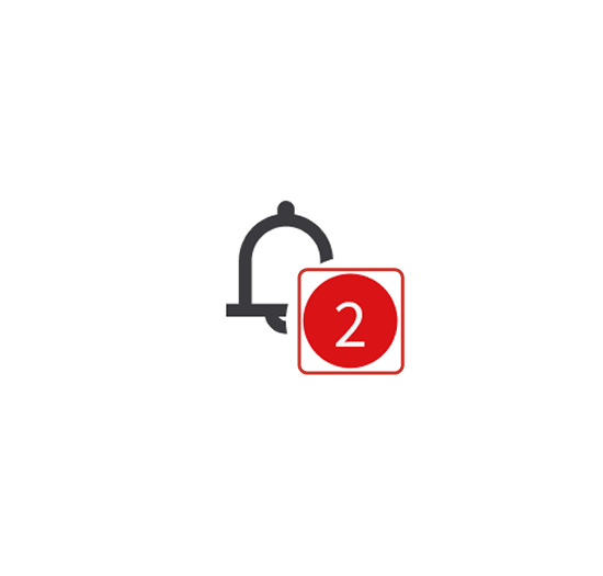
Notification Badges
You can combine a system icon with a notification badge, which temporarily displays a small visual indicator to convey a real-time status, a notification, or an alert. Examples include a dot, a badge with a number, or a symbol. Badges aren’t static—they appear contextually to signal that there’s an action or an update requiring the user’s attention, such as unread messages, pending settings, or system alerts.
Place the badge in the top-right corner of the system icon.
Do
Don’t
The color of the badge should reflect the standard status.

color/accent/neutral/weaker, #E0E0E1
color/success/default, #2AC371
color/warning/default, #F98300
color/info/default, #0072ED
color/caution/default, #FFD100
color/error/default, #DA1217Customization
The IDS system icons represent common product actions and objects across several industries. Before creating additional system icons, aim to use what’s available in the current library. If you ultimately do need a new icon, be sure to create and implement it in a way that’s consistent with others in IDS. For help, or to suggest a new system icon, contact us in the UI-UX Design channel in the IDS Microsoft Team.
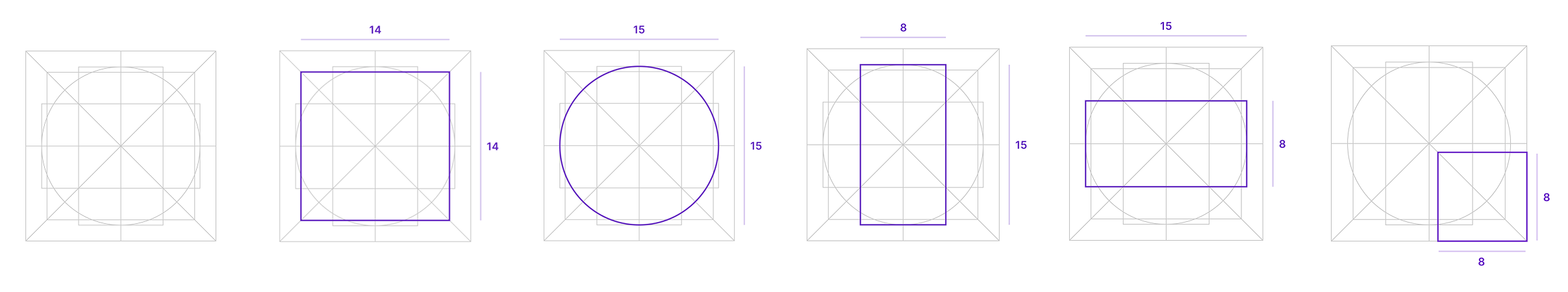
Keylines
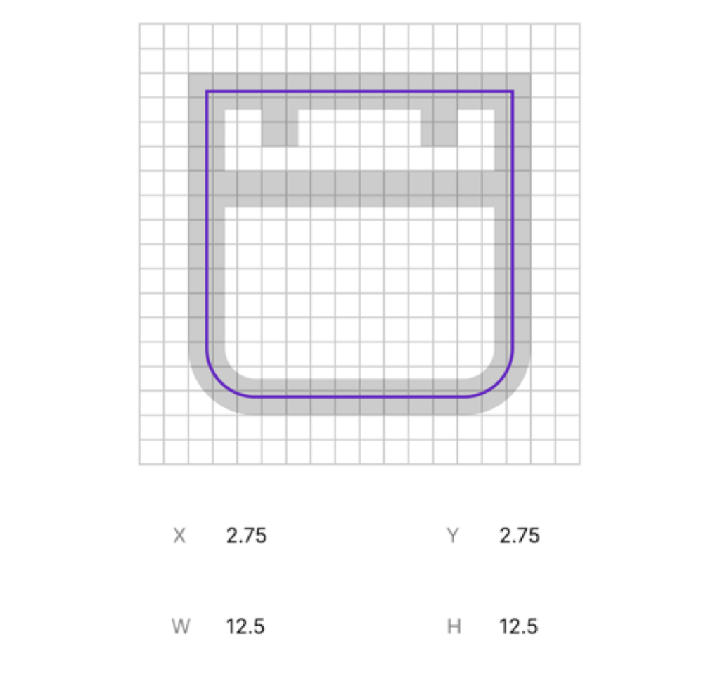
Keylines help maintain consistent weight, optical size, and placement across an icon set by guiding the alignment of basic shapes like circles, squares, and rectangles.
While keylines will support most icons, some won’t apply. Examples include:
- Shapes that are balanced unusually, like those that are especially tall or wide.
- Open shapes—like chevrons, pluses, and minuses—are drawn at a slightly smaller size.
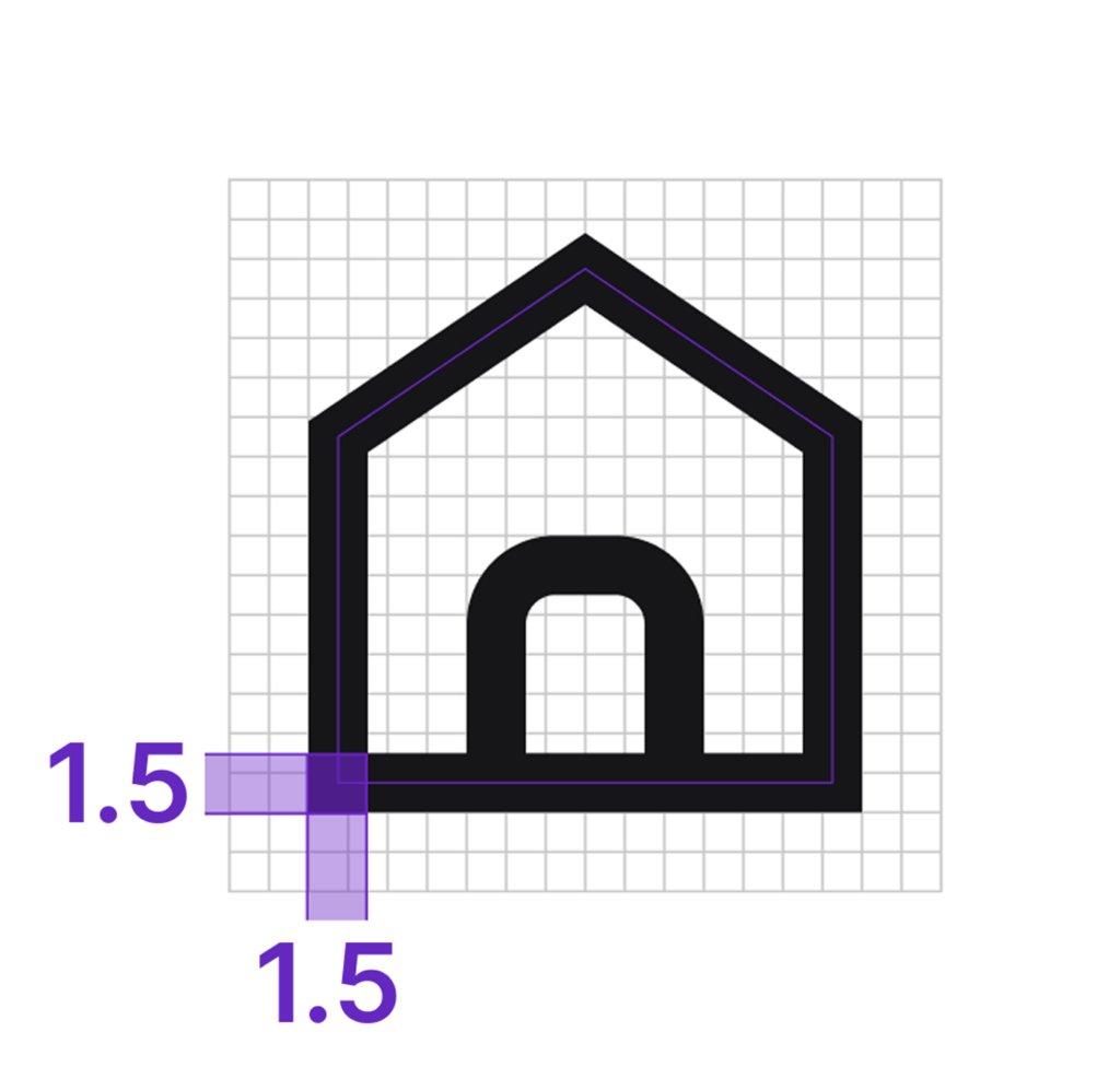
Line Weight
Always use a 1.5 point (pt) stroke, centered on the path. Never modify the line weight for the purpose of allowing more detail in a system icon. Exceptions to this are when icons require a different line weight to convey intent, like icons for bold or extra light text formatting options.
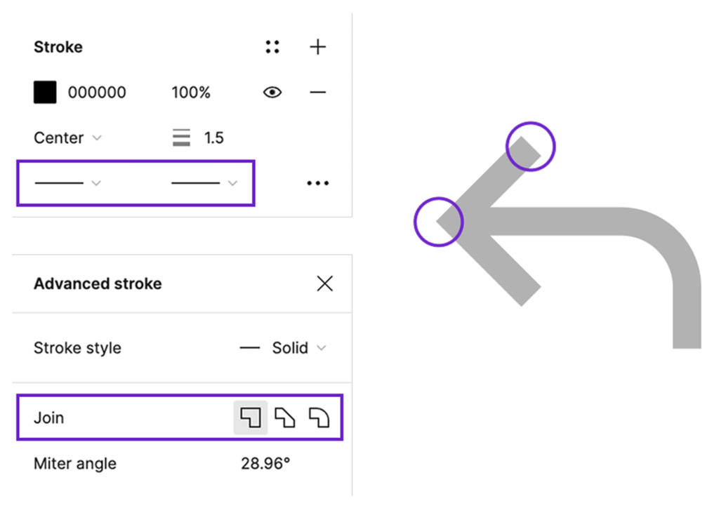
Joins and End Caps
Always sharp.
Corners
While most edges and corners are sharp, some are rounded for a softer look. Use 2 pt as the corner radius, adjusting it based on the shape and scale of the depicted object.

These rounded corners are generally applied to the bottom edges of the system icons. Let the real-world object that the icon symbolizes inform which corners to round off, aiming for increased familiarity and recognizability.
Do
Don’t
The corner radius shouldn’t exceed 2 pt.
Modifiers
When a modifier overlaps a primary system icon, use a margin of at least 1.5 pt with a modifier size of 8×8 pt. Use only one modifier at a time and place it in the bottom-right corner of the primary system icon. See more instructions for placing modifiers.
Pixel Perfection
On high-density (@2×) displays, aim for pixel perfection. On low-density (@1×) displays, aim for best results. To ensure best results on both low- and high-res displays, set the outlines of shapes exactly on .25 or .75 coordinates. This ensures that outlines sit perfectly on the pixel grid, giving the icon a crisp appearance. Exceptions to this placement apply only to icons that require a centered line, such as horizontal or vertical arrows, as well as those like pluses and minuses.
Exporting
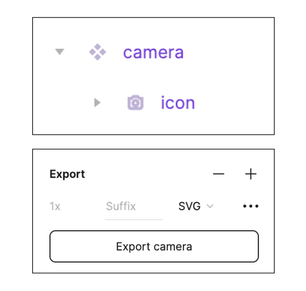
When finalizing an icon, combine all shapes into a single layer. This makes them easier to work with in both Figma and in code. Name the layer “icon” and size the frame to 18×18 pixels before exporting it as an SVG.
Decorative Icons
Decorative icons are colorized versions of the IDS system icons. Use them with text or links to help improve readability or indicate status, such as error, warning, or info.
Sizing, Padding, and Alignment
Decorative icons are 24×24 pixels (px). The system icon inside is 18×18 px. The IDS system icon is placed centered in a colored circle to increase discoverability inside the UI.
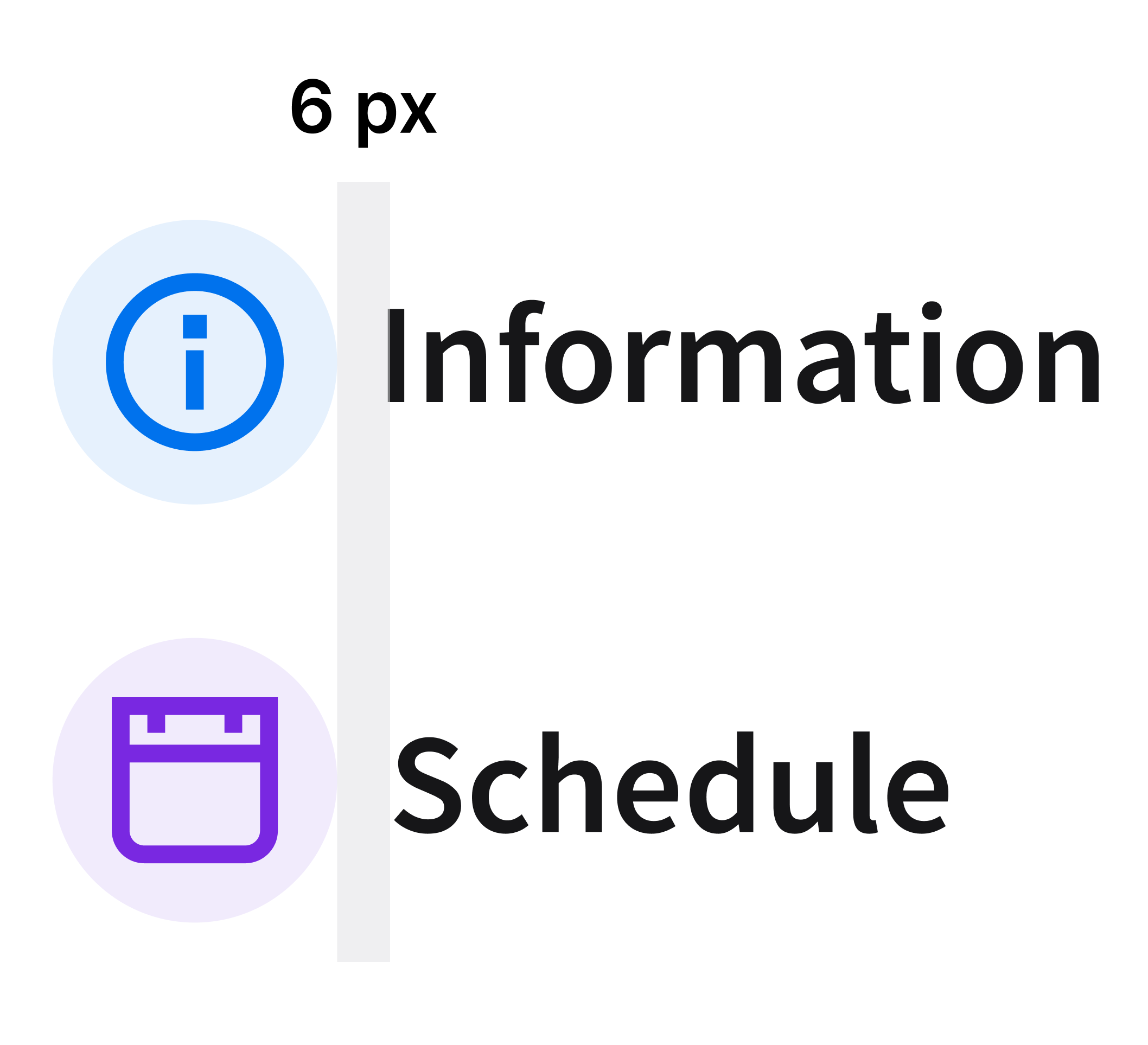
When pairing a decorative icon with text, the decorative icon is left aligned. Include 6 px of padding.
Do
Don’t
Do: Use the decorative icons correctly, in their intended sizes, as shown in this slimcard example. Don’t: Scale up the decorative icons. This example shows an empty state, which has its own separate library of icons.
Colors
Color usage follows the IDS design tokens structure to ensure consistency across applications. Each color is defined by a token (for example, color/accent/blue/strong) and its corresponding HEX value. This makes it easier for designers and developers to apply the correct shade across different contexts.
When a decorative icon is used for informational purposes, use blue.
- Icon:
color/info/default, #0072ED - Container:
color/info/weak, #E6F1FD

When a decorative icon accompanies disabled text, use gray.
- Icon:
color/accent/neutral/default, #6F6F76 - Container:
color/info/weakest, #F5F5F5

For statuses, use the following colors:
Green for success.
- Icon:
color/success/default - Container:
color/success/weak, #EBF9F1

Orange for caution.
- Icon:
color/warning/default,, #F98300 - Container:
color/warning/weak, #FEF2E5

Red for error.
- Icon:
color/error/default, #DA1217 - Container:
color/error/weak, #FBE7E8

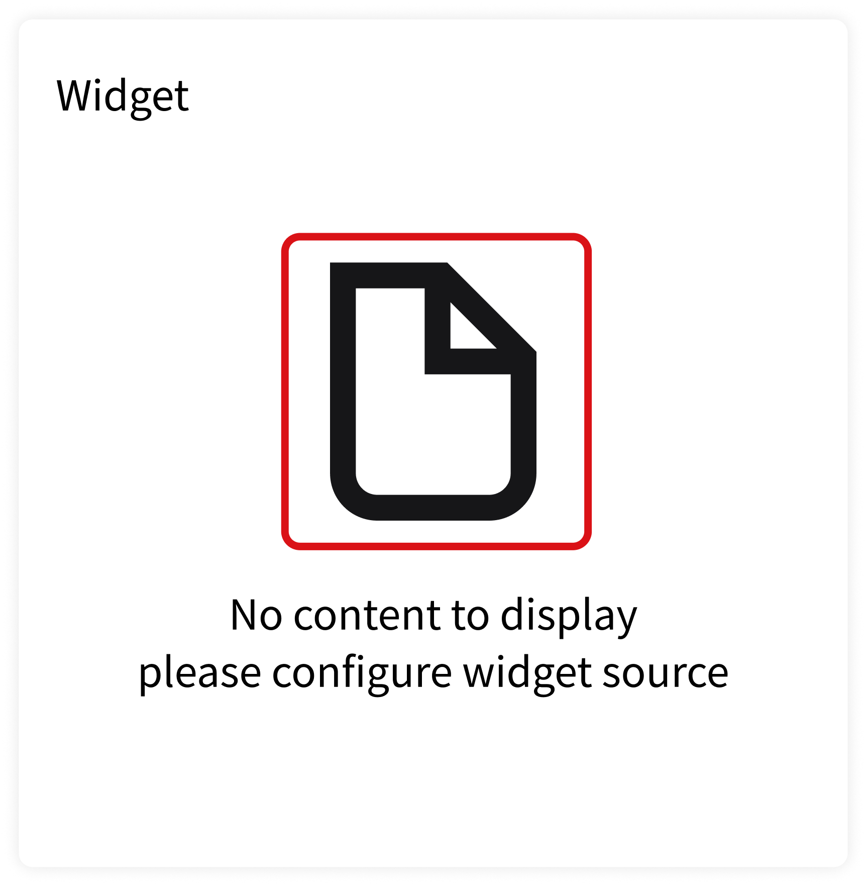
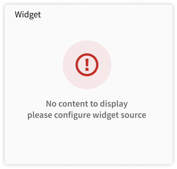
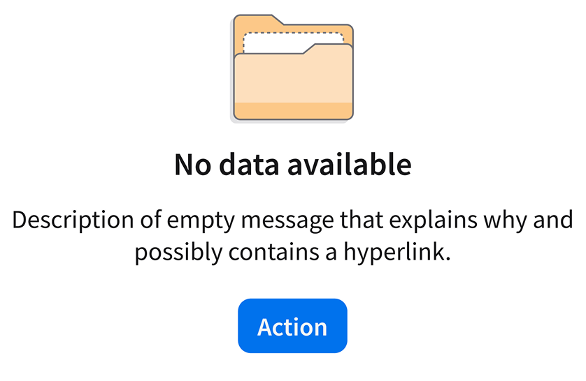
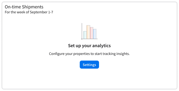
Empty State Icons
Empty state icons are large, decorative illustrations. They visually communicate to the user that there’s no specific content or data to be displayed. The accompanying empty state message should provide more information or a related action for the user, if applicable. For usability guidance and implementation, see the empty message component. To learn how to write effective empty state messages, see the UX writing guidelines.
Empty state icons can be used only in cards and widgets.
Example of an empty state icon on a card.
Do
Don’t
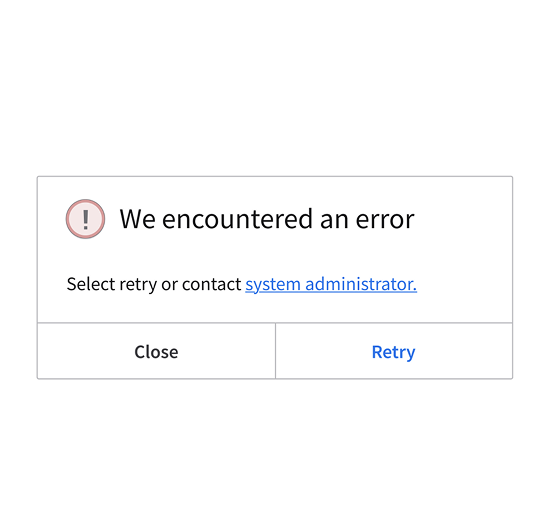
Do: An empty state icon used correctly in an example of an empty state message. Don’t: Scale down the empty state icons. This example shows a system feedback modal, which should use a decorative icon.
Sizing, Padding, and Alignment
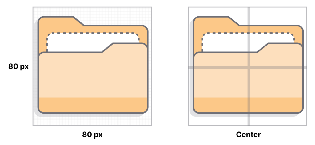
Empty state icons are 80×80 pixels (px). Center an empty state icon within its container, both horizontally and vertically, to ensure proper visual hierarchy.
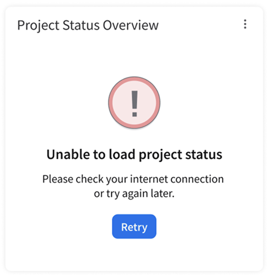
Do
Don’t
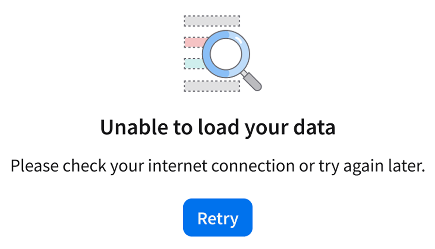
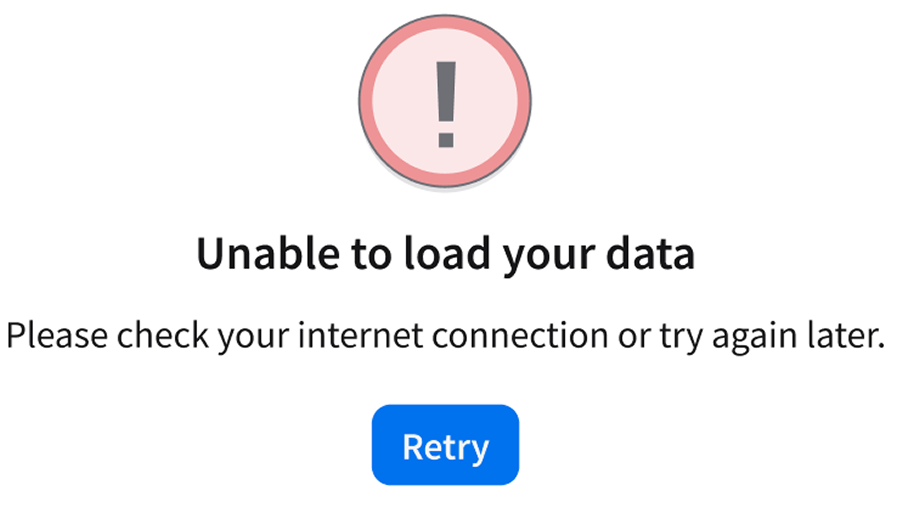
Do: In an error state message, use the icons that are specifically meant to signify an error to the user. Don’t: Use an empty state icon with a neutral meaning to communicate an error.