Icon
An icon is a visual symbol that represents a common object, action, or concept—designed for consistency, quick recognition, and easy interaction.
Anatomy
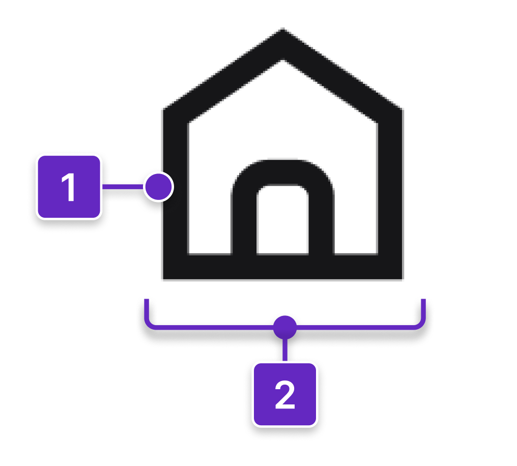
- Icon
- Frame
Options
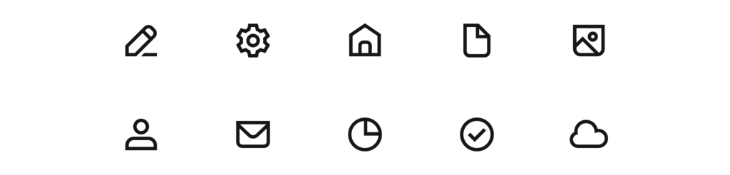
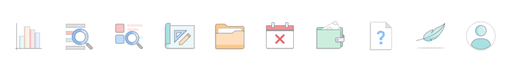
1. System icons (18×18 pixels)
- Used to represent controls or specific actions.
- Drawn in a minimalistic style with simple geometric shapes.
- Provide optimal legibility at a small size.
- Used in toolbars, module navigation, data grids, and hyperlinks.
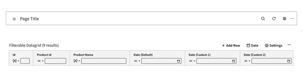
Examples of system icons used in a header (top) and a toolbar (bottom).
2. Decorative icons (24×24 pixels)
- Colorized versions of system icons.
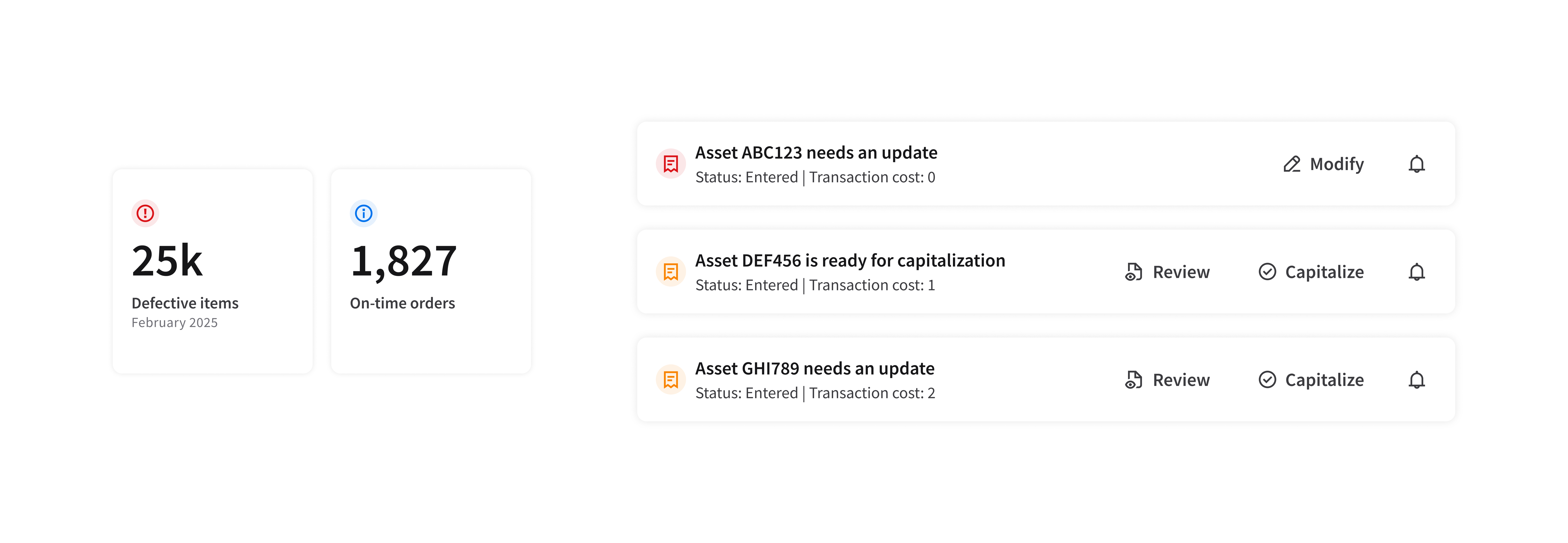
- Used with text or links to help improve readability or indicate status (such as error, warning, or info).
Examples of decorative icon statuses
Examples of decorative icons in a modal (left) and slim cards (right).
3. Empty state icons (80×80 pixels)
- Decorative illustrations that accompany a clear message.
- Used in cards and widgets to inform the user that no data is available, an error has occurred, or a process has been completed.
Examples of empty state icons.
Example of a complete empty state, with an icon, a message, and a button.