Tokens
Overview
A design token is a piece of data that represents a color, font, or other foundational UI attribute, like a color hex code or a font size.
Each design token has a descriptive name that summarizes its purpose or use case. You can think of design tokens as codified design decisions.
Tokens enable unified visual styles across products and industries, reducing constraints that often arise during implementation. Since tokens don’t depend on specific frameworks or technologies, they can integrate into tools that teams already use.
As changes are made to the underlying value of a token, updates cascade out to other instances. With more flexibility, styles can sync across separate codespaces, devices, and platforms. The units and outputs are also adaptable, allowing teams to implement a font size in either pixels or em.
For example, a common color used in our products is #0072ED, or Azure-06. It’s the shade of blue that often conveys interactivity within elements, like buttons and links. In other contexts, the same color represents items that a user has already selected in a tab or dropdown.
Both of these discrete decisions contribute to our cohesive visual style, but a scalable design system requires the capability to evolve gradually. Without a way to differentiate between these scenarios, updating either would demand significant effort from individual designers and developers to prevent potential conflicts. By compartmentalizing the design language into smaller pieces, it becomes more modular in how we use it.
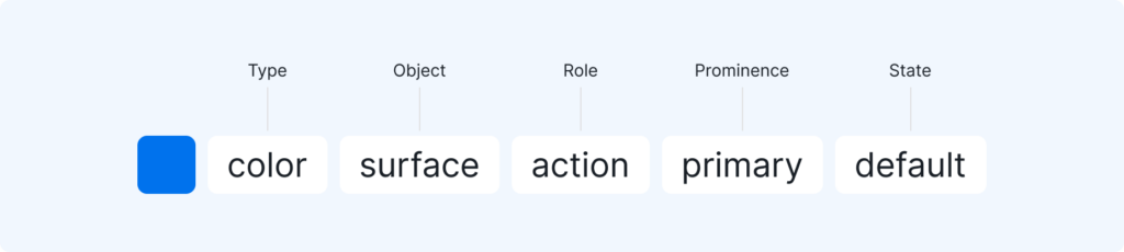
So by applying design tokens like $color-interactive, for element interactivity, and $color-selected, for user selections, we can distinguish these scenarios within code and design tools.
Design tokens are paired names and values that represent foundational styles in IDS.
Tokens simplify the way we interpret and apply visual design styles, resulting in more cohesive, scalable interfaces.
Rather than hardcoding values like color hex codes and pixel sizes, we abstract the values to a nickname that doubles as a description for when to use the style. Not only does it help a large organization like ours create consistent, effective designs, but it reduces maintenance and margin for error.

Tiers
There are 3 layers of design tokens, each with a distinct purpose:
Core
The core level are values that represent each option in the design system. While the names communicate the primitive value, they intentionally don’t define a use case. They don’t support theming, so it’s always better to use a semantic token when one is available.
Semantic
Rather than conveying the value, semantic tokens summarize through the naming convention when the style should be used. This helps enable consistency and alignment throughout large orgs like ours.
Semantic tokens support multiple modes, allowing different values depending on the theme.
Component
Not reflected in Figma, these are component-specific semantic tokens that are implemented in code to enable maximum flexibility for consuming teams.
Themes
On a broader scale, a theme is a collection of specific tokens with predefined values that collectively deliver a completely alternate UI aesthetic. Teams that integrate design tokens can offer different themes, like dark mode, to customers within their application.
Naming